
INTERNAL CONCEPT2025
Reinventing the digital ordering experience for a local Lagos restaurant.

- Timeline
- 2 weeks
- Services
- Website design & Development
- Team
- 3 Person team
Scope
- Website Redesign
- UX Strategy
- Ordering Experience
- Frontend Development
OVERVIEW
A better dining experience starts before the first bite.
Awoof is a local restaurant in Lagos, Nigeria. When we discovered their website, it was unavailable and no longer served as a useful customer touchpoint.
Instead of simply redesigning the interface, we explored how a restaurant website could become a direct ordering experience that builds trust, showcases Nigerian cuisine, and reduces reliance on third-party platforms.
THE PROBLEM
An experience that wasn’t serving the business or its customers.
An Outdated Digital Experience
The website no longer showcased the restaurant’s quality or personality. Its outdated design hindered trust and left a poor first impression.
No Seamless Ordering Journey
Customers lacked a clear path from meal discovery to order placement. The disorganised flow made the process less convenient.
Missed Opportunity for Direct Sales
Rather than generating revenue, the website served as a basic online presence. Without direct ordering, the business lost chances to convert visitors into customers.
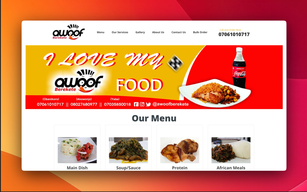
Image 1: Awoof’s previous website before it went offline. The experience felt outdated and wasn’t designed to drive direct online orders.
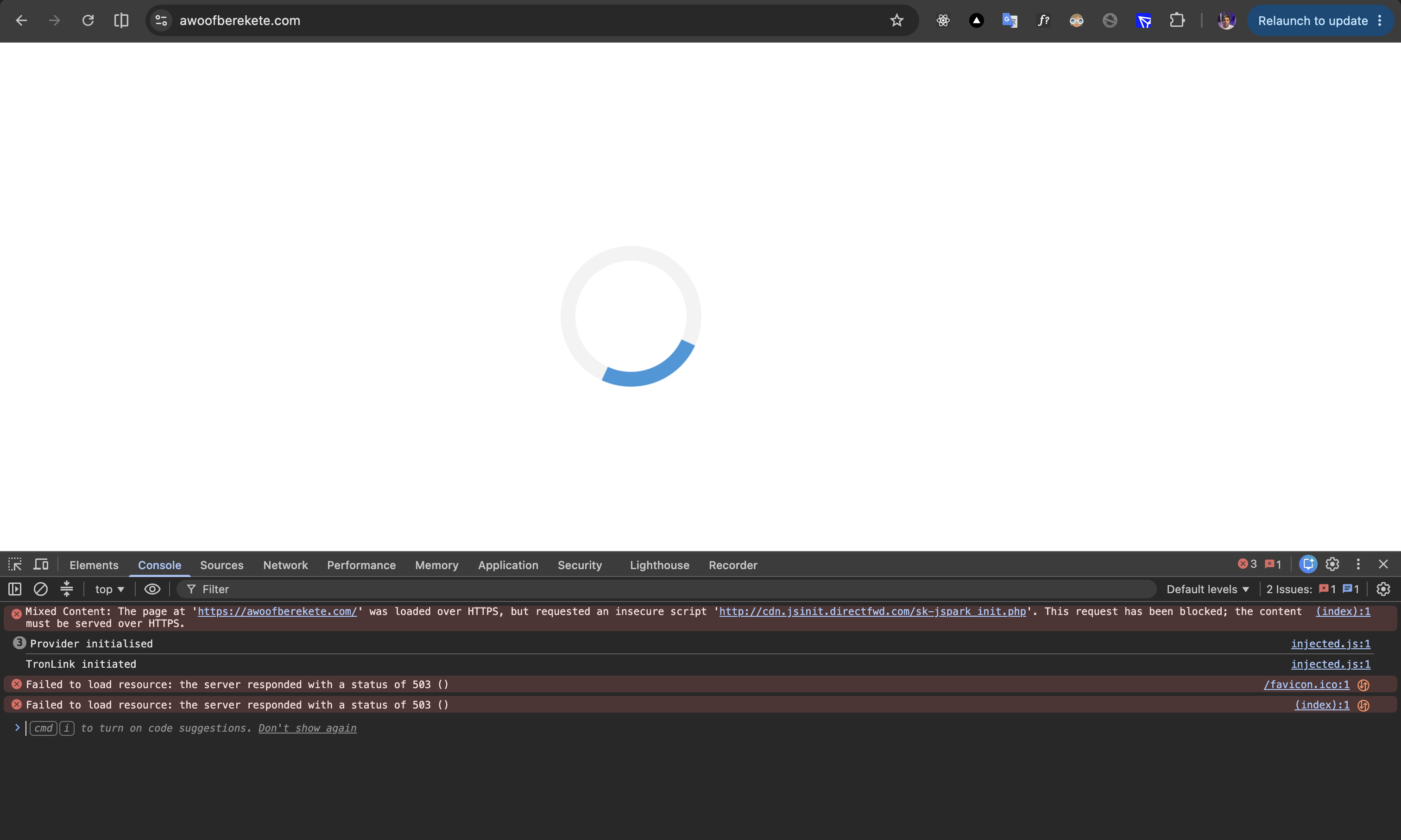
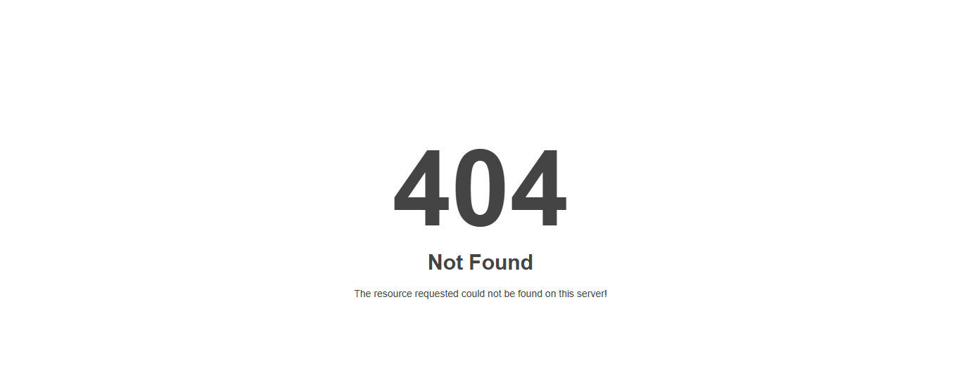
Image 2: The website is no longer accessible, removing an important channel for customers to discover the restaurant and order online.
OPPORTUNITY
Turning a restaurant website into a direct sales channel.
Direct Ordering
Reduce reliance on third-party platforms by giving customers a seamless way to order directly.
Customer Trust
Create a digital experience that reflects the warmth, quality, and personality of the restaurant.
Higher Conversion
Guide visitors from discovering meals to completing an order with less friction and greater confidence.
SOLUTION
A modern restaurant experience designed to turn visitors into customers.
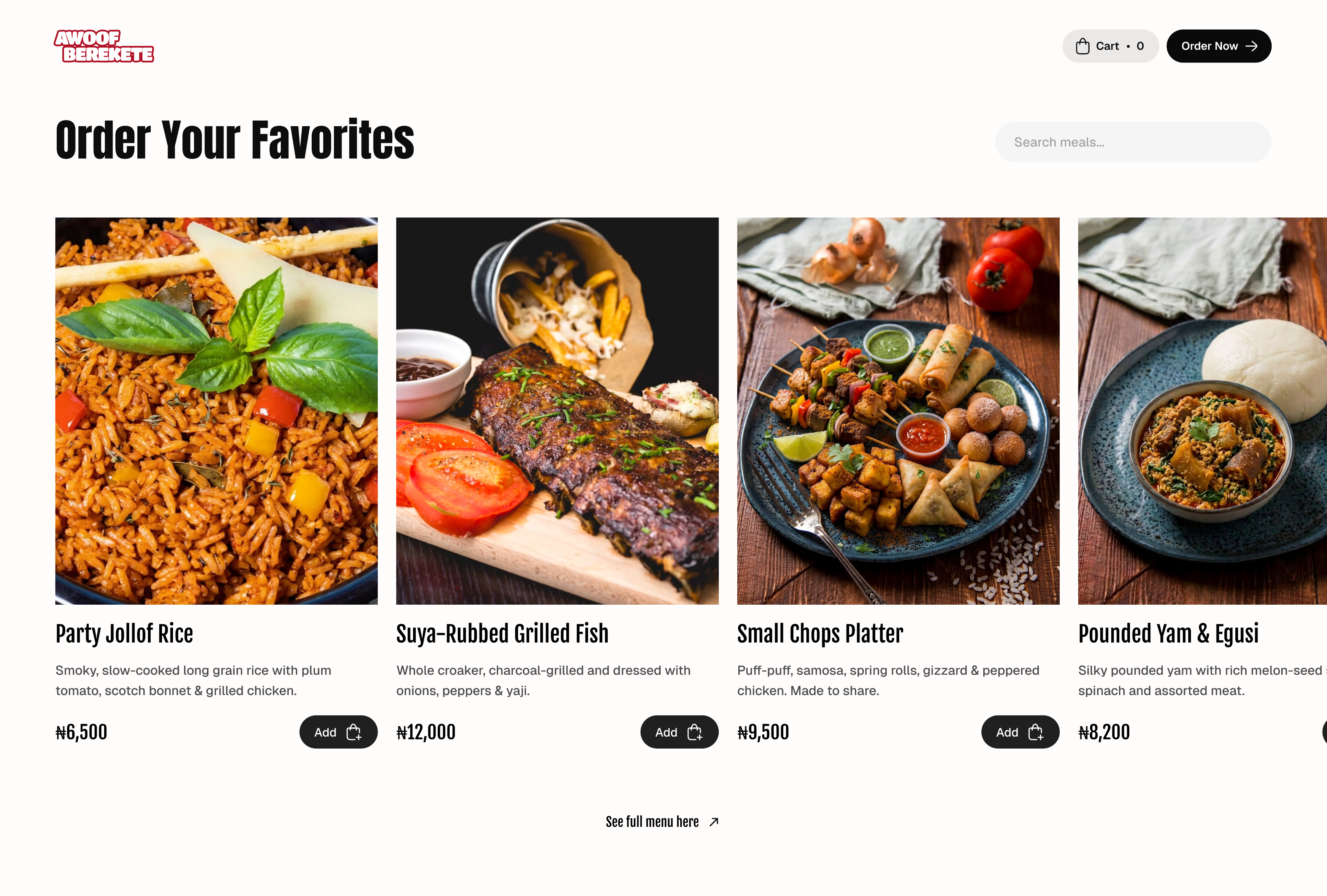
Designing for hungry customers, not empty clicks.
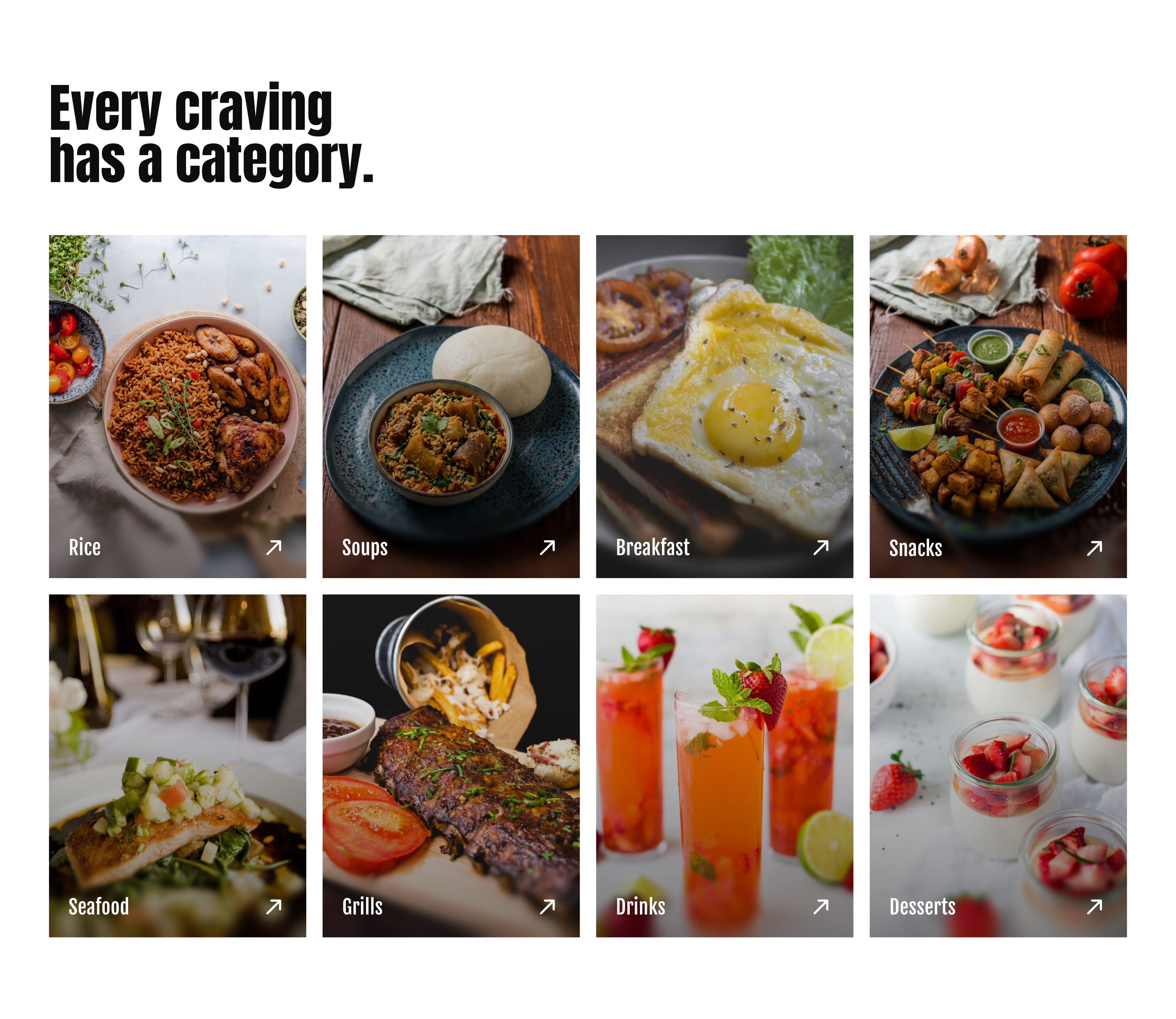
Upon arrival, most guests share a singular aim: to discover delicious food and place their orders. Rather than starting with a conventional hero banner, we prioritised the menu as the first visual element, streamlining the experience and enabling quicker ordering.
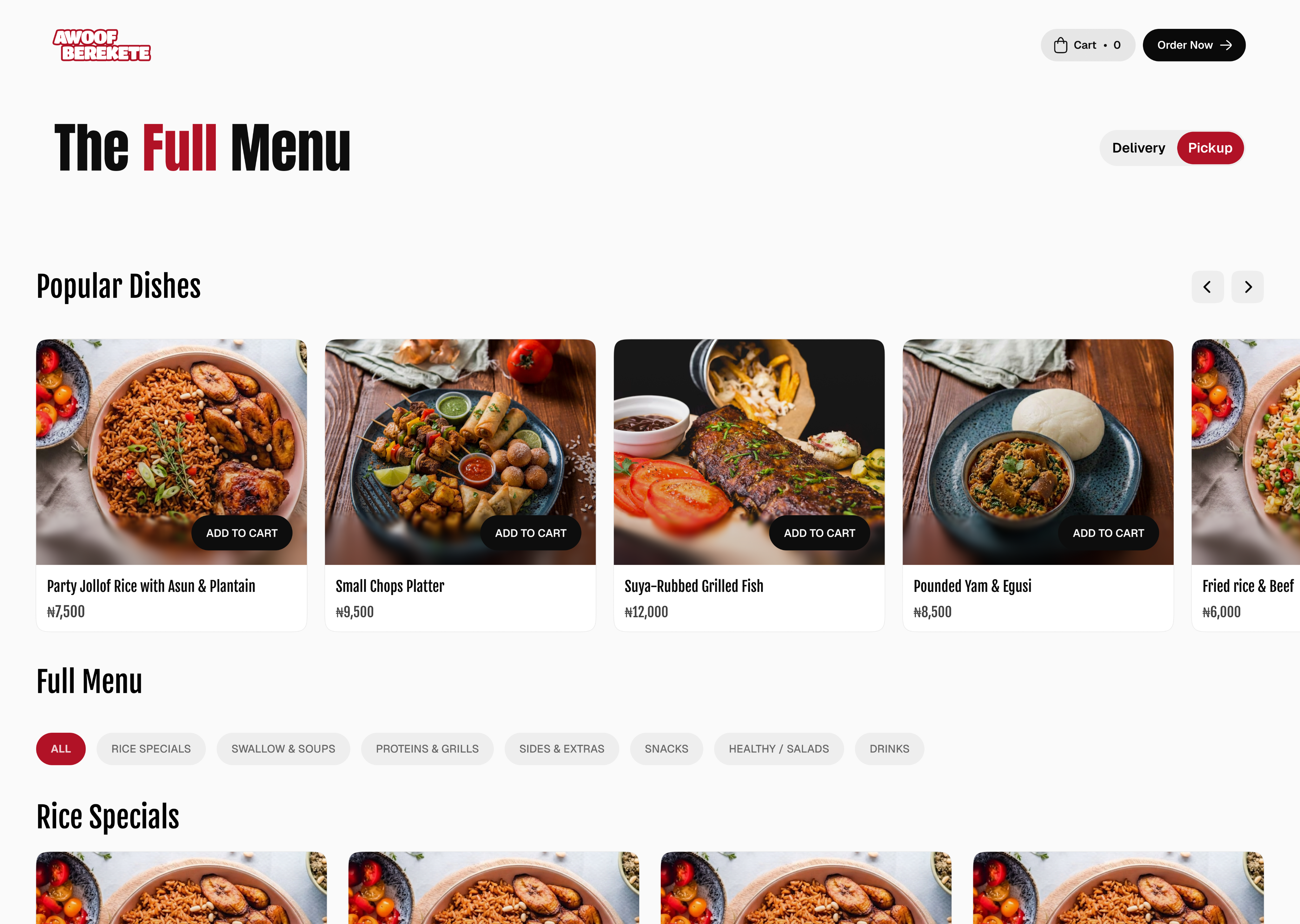
Put the food first.
Hungry customers shouldn’t have to search for the menu. We brought the restaurant’s best meals to the forefront, making ordering the first interaction instead of an afterthought.
DESIGNING FOR HUMANS
Design decisions should reflect how people actually behave.
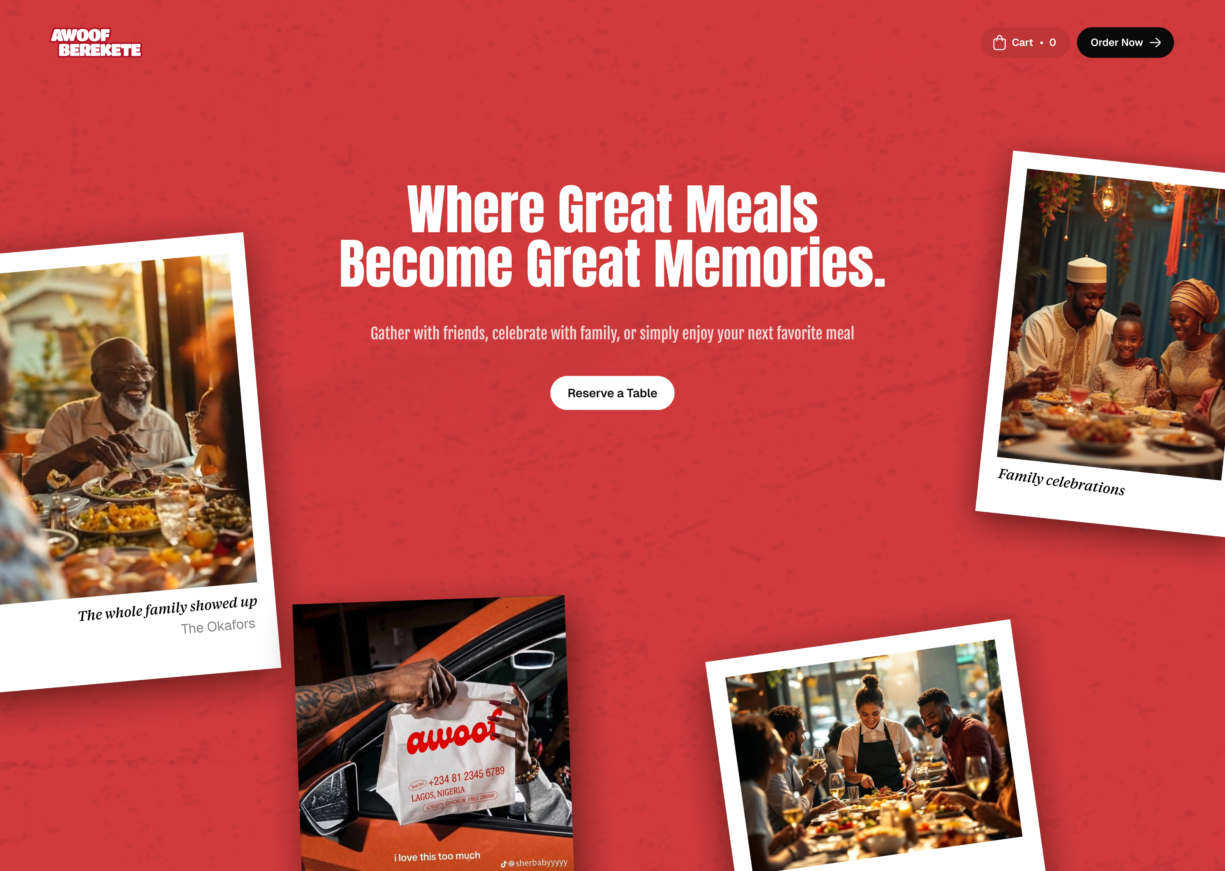
This led us to ask:
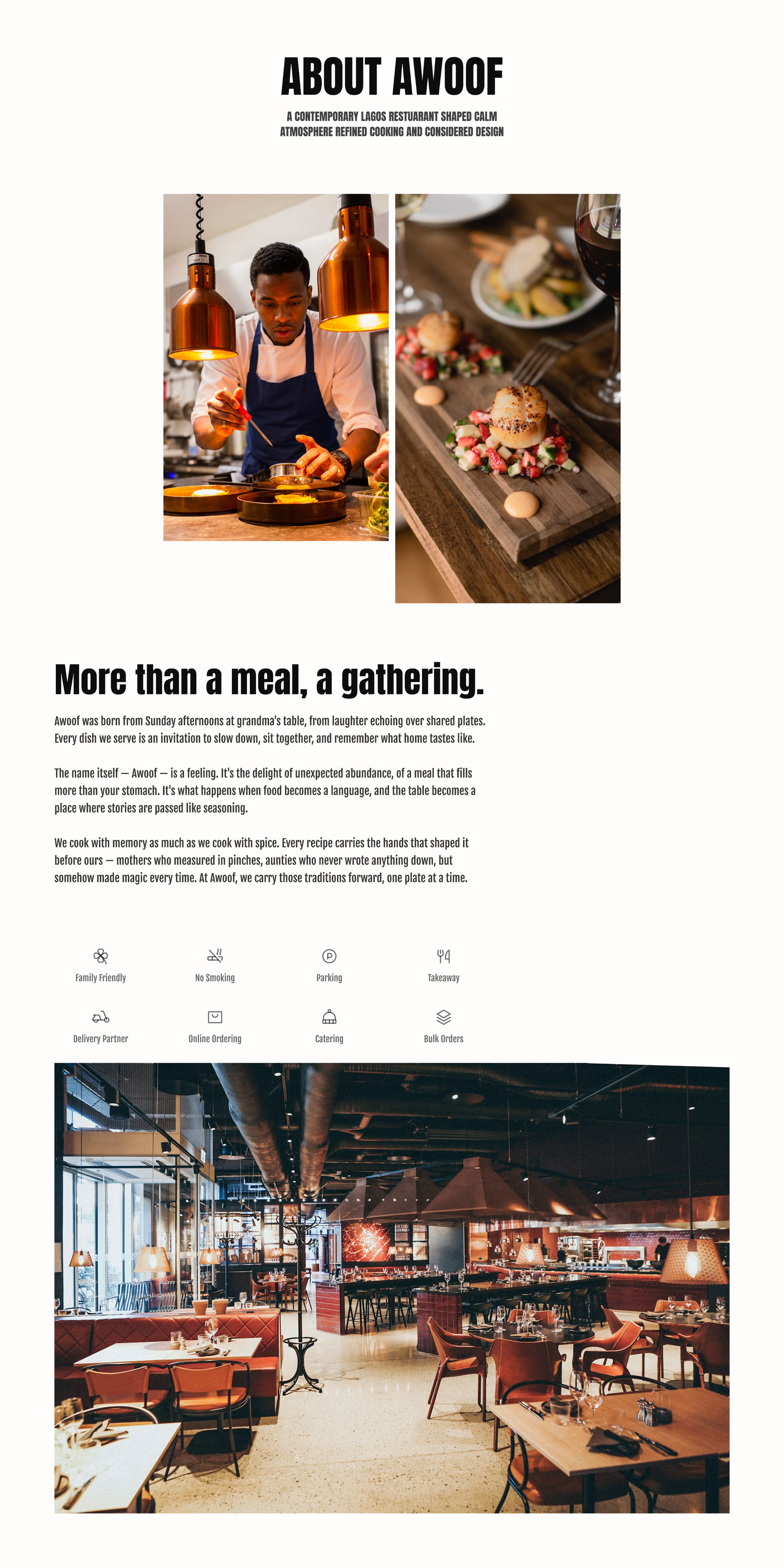
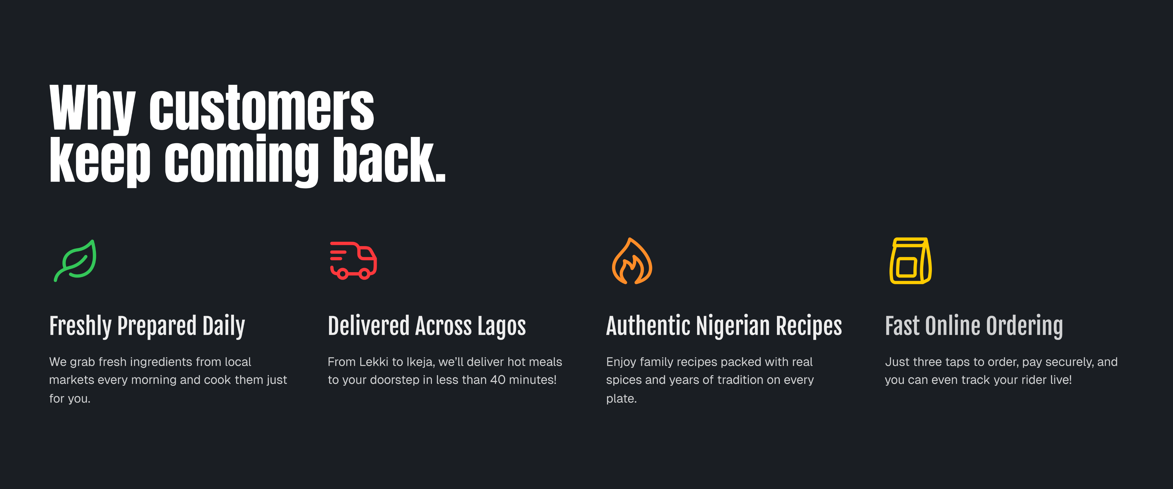
What if every screen was designed to reduce friction while strengthening human connection?
CORE EXPERIENCE
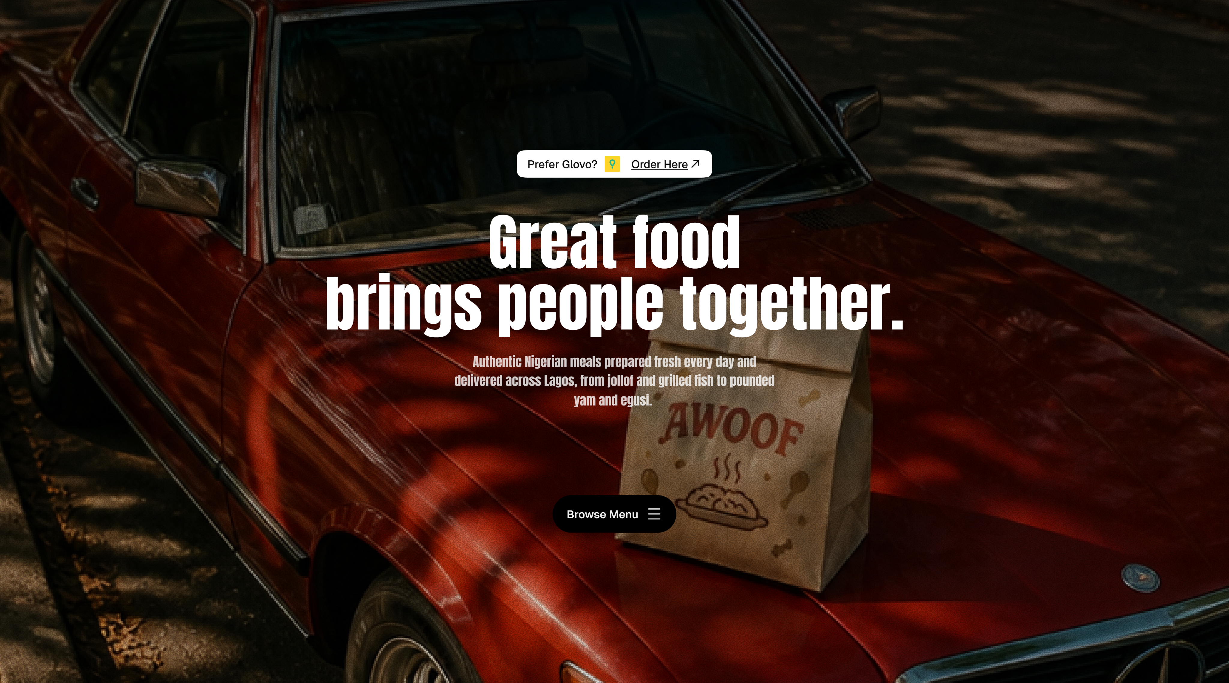
DESIGN DECISIONS
Every decision balanced user experience with real-world implementation.
Average journey from homepage to checkout.
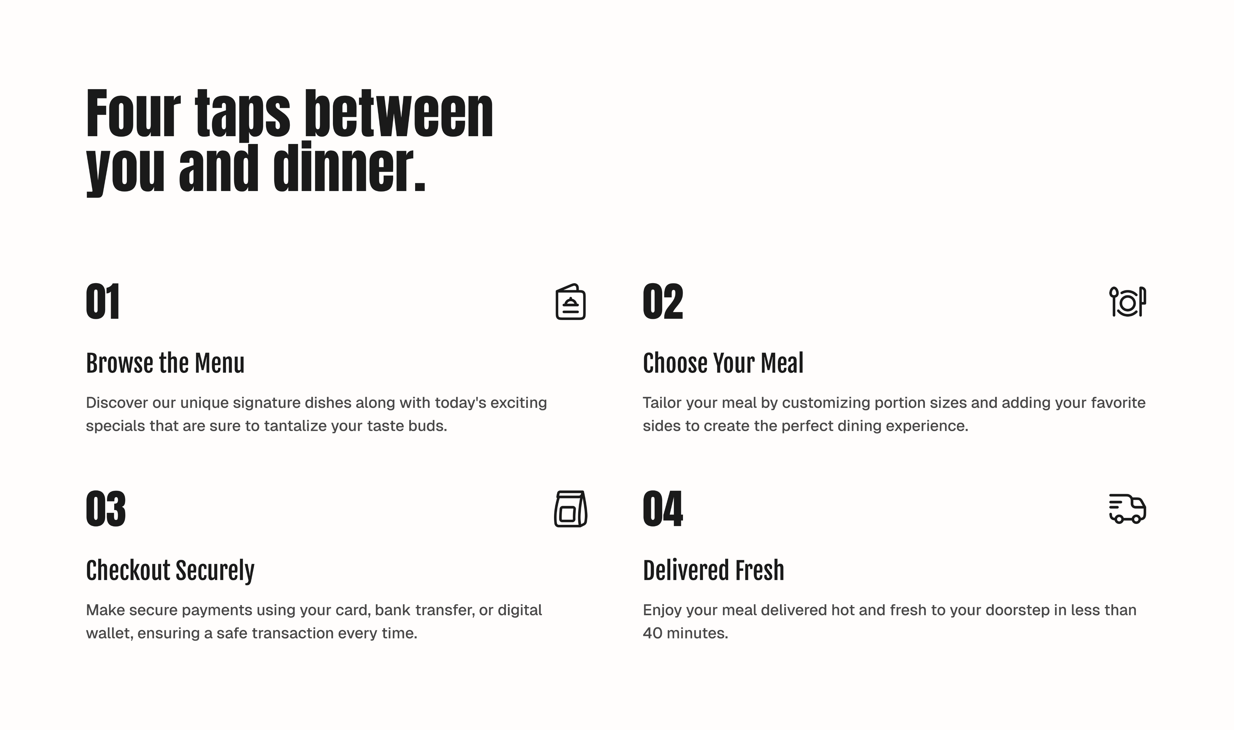
Menu page → Food Details → Cart → Checkout.
Optimised for fast ordering across all devices.
The menu replaces the traditional hero banner as the first interaction.
KEY TAKEAWAYS
Two quick takeaways
Design for intent
People visit restaurant websites to order, not to browse endlessly.
Reduce friction
Every unnecessary step is a chance to lose a customer.
See It in Action
The redesign was fully developed to demonstrate how thoughtful strategy, design, and development come together in a real product.
View Live Website
Ready to build something better?
Tell us what you’re building and we’ll help define the right path forward.